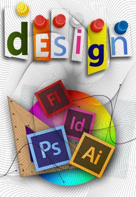
Graphic Design
Graphic design is the craft of creating visual content to communicate messages. Applying visual hierarchy and page layout techniques, graphic designers use typography and pictures to meet users’ specific needs and focus on the logic of displaying elements in interactive designs to optimize the user experience.
Graphic Design – Molding Users’ Experience Visually
Graphic design is an ancient craft, dating back past Egyptian hieroglyphs to 17,000-year-old cave paintings. As a term originating in the 1920s’ print industry and covering a range of activities including logo creation, it concerns aesthetic appeal and marketing – attracting viewers using images, color, and typography. However, graphic designers working in user experience (UX) design must justify stylistic choices regarding, say, image locations and font with a human-centered approach, focusing on—and seeking maximum empathy with—users while creating good-looking designs that maximize usability. Aesthetics must serve a purpose – in UX design we don’t create art for art’s sake. So, when doing graphic design for UX, you should consider the information architecture of your interactive designs, to ensure accessibility for users, and leverage graphic design skills in creating output that considers the entire user experience, including users’ visual processing abilities. For instance, if an otherwise pleasing mobile app can’t offer users what they need in several thumb-clicks, its designers will have failed to marry graphic design to user experience. The scope of graphic design in UX covers creating beautiful designs that users find highly pleasurable, meaningful, and usable.
Type Of Graphic Design
Although the digital age entails designing with interactive software, the graphic design still revolves around age-old principles. Striking the right chord with users from the first glance is crucial. As a graphic designer, you should have a firm understanding of color theory and how vital the right choice of color scheme is. Color choices must reflect not only the organization (e.g., blue suits banking) but also users’ expectations (e.g., red for alerts; green for notifications to proceed). You should design with an eye for how elements match the tone (e.g., sans-serif fonts for excitement/happiness) and overall effect, noting how you shape users’ emotions as you guide them from, say, a landing page to a call to action. Often, graphic designers are involved in motion design for smaller screens, carefully monitoring how the work’s aesthetics match users’ expectations and enhance usability in a flowing, seamless experience by anticipating their needs and mindsets. With user psychology in mind, some especially weighty graphic design considerations are:
- Symmetry and Balance (including symmetry types)
- Flow
- Repetition
- Pattern
- The Golden Ratio (i.e., proportions of 1:1.618)
- The Rule of Thirds (i.e., how users’ eyes recognize good layout)
- Typography (encompassing everything from font choice to heading weight)
- Audience Culture (re Color Use and Reading Pattern)
Overall, the mission via-à-vis graphic design is displaying information harmoniously – beauty and usability must go hand in hand, discreetly carrying your organization’s ideals. Through a trustworthy visual presence, you hint to users that you know what they want to do – not just because you’ve arranged aesthetically pleasing elements that are where they expect to find them or help them intuit their way around, but because the values your designs display mirror theirs, too.
About Graphic Design
Have you ever found yourself spotting shapes in the clouds? That is because people are hard-wired to recognize patterns, even when there are none. It’s the same reason that we often think we know where to click when first experiencing a website—and get frustrated if things aren’t where we think they should be. Choosing the right user interface design pattern is crucial to taking advantage of this natural pattern-spotting, and this course will teach you how to do just that.
User interface design patterns are the means by which structure and order can gel together to make powerful user experiences. Structure and order are also a user’s best friends, and along with the fact that old habits die hard (especially on the web), it is essential that designers consider user interfaces very carefully before they set the final design in stone. Products should consist of such good interactions that users don’t even notice how they got from point A to point B. Failing to do so can lead to user interfaces that are difficult or confusing to navigate, requiring the user to spend an unreasonable amount of time decoding the display—and just a few seconds too many can be “unreasonable”—rather than fulfilling their original aims and objectives.
While the focus is on the practical application of user interface design patterns, by the end of the course you will also be familiar with current terminology used in the design of user interfaces, and many of the key concepts under discussion. This should help put you ahead of the pack and furnish you with the knowledge necessary to advance beyond your competitors.
So, if you are struggling to decide which user interface design pattern is best, and how you can achieve maximum usability through implementing it, then step no further. This course will equip you with the knowledge necessary to select the most appropriate display methods and solve common design problems affecting existing user interfaces.


